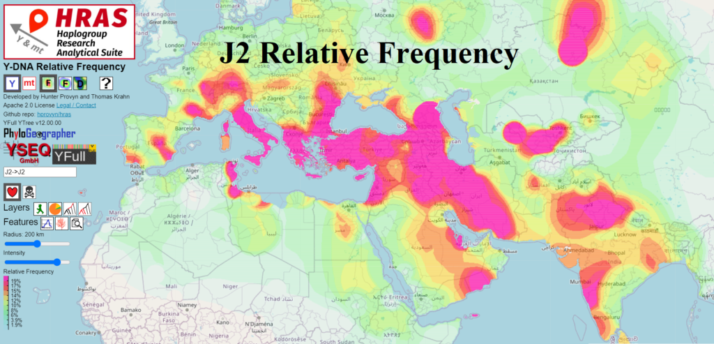
In the initial implementation, the default scaling set magenta to correspond to between 90-100% of the maximum relative frequency.
For many haplogroups, however, this resulted in what appeared to be blank maps, because the maximum relative frequency only covered a small area. For J2b-Z1043 this was the island of Montserrat, corresponding to 100% relative frequency due to a low sample rate of 1 sample. For J2b-M205 this was the island of Socotra, which, due to a founder effect, comprises around 80% of that island’s population. Because the areas of next highest frequency are nowhere near these maxima, the map appears blank and may lead someone to conclude that it isn’t working.
I’ve now changed the default scaling such that at least 5% of the non-zero area of the haplogroup’s distribution will be assigned to the magenta band. This guarantees a more representative view of a haplogroup’s distribution. To then get a clearer view of the differences between the highest frequency areas, you can scale down the intensity.
