You can listen to me narrate on Spotify while you scroll through the heatmaps at the bottom of this page.
Y Heatmap is a relative frequency heatmap computed from samples on the YFull tree. That means it shows where, per capita, more or less people are positive for whatever haplogroup you look up, by entering the SNP.
Y Heatmap was developed by Thomas Krahn (YSEQ) and me, Hunter Provyn, with permission from YFull to use their geolocated samples.
If you want to use it or have a question about how to use it, please read the Usage section which is like an FAQ. For more technical information see the Methodology section.
While exact origins cannot usually be known for most lineages, researchers will often describe a lineage with a rough geographic descriptor - i.e. "North African". Sometimes they just mean this is where most people live now, but sometimes they mean that the ancestor likely lived there.
No one is an expert on every haplogroup.
So I have found it useful, when interpreting a heatmap, to compare it to heatmaps of other lineages which I already know more about, having looked at the geographic diversity of the earliest branches and where the oldest ancient samples were found.
It makes sense that lineages that have likely originated in the same or nearby region at around the same time may have experienced similar catastrophes or events / interactions that impact male line demographics and drive migrations to particular regions at particular times. This is because in any given place even within the same ethnic groups or states, there is some variation in male line haplogroups even if no one knows it and thinks of themselves as part of the same culture.
If you are trying to decide if a heatmap looks more indicative of one region than another, it helps to look at examples of better known haplogroups whose origin or at least distribution is better understood.
If your lineage is small but you know you are from a particular region you may find it interesting to look at the distribution of a more prolific lineage from the same region with the same age. You can get an idea of where your relatives who have not yet tested might be living.
The seed was planted for me when I asked the question, is a lineage in my haplogroup really Italian in origin? We do have an ancient Etruscan but we have older samples in the Balkans. After some digging I found a lineage that really was Italian, R1b-Z56, and it was interesting that this lineage doesn't have a single sample from the Balkans on the YFull tree. This reinforced what I already knew from the archaeological record, that western Balkan lineages as old as mine had a propensity to go to Italy.
Here I have assembled a collection of 20 haplogroups that I think show how groups that formed in different regions at different times have been able to spread. I'm sorry if I didn't include the region of interest to you.
This list is by no means exhaustive, consider it an initial overview that attempted to cover most of the geography. Check your haplogroup research forums / groups to see if others have shared heatmaps of more specific geography / ethnic groups you are interested in.
Keep in mind:
- This heatmap does not grant more weight to ancient samples or samples showing more upstream diversity in a particular location. Every sample is treated the same - that is why it is called a relative frequency heatmap.
- Consequently, areas of highest frequency, in shades of red, do not necessarily indicate the origin, though in many cases they coincide.
- Magenta on one map doesn't mean the same intensity throughout that map - anything above a threshold will be the same shade of red. An initial threshold is automatically computed based on the samples but can be changed by clicking the +/- button on the left. So if everything is magenta/red and you want to see which region really has higher per capita frequency, click the minus.
- A haplogroup could have a high relative frequency in an area that is not shown because they have not tested. Please mind the gaps.
- Please note that for each region I have decided to showcase, there are no doubt many other haplogroups present, some in high numbers. I am not implying by my selection that the haplogroup I chose is the most prevalent in that area, or by association, ethnic group.
- The "Approximate Frequencies" legend is a new feature. The calculation is complex and there are several challenges / sources of inaccuracy in attempting to calculate this using the heatmap.js library which requires a set of points as inputs which are given a triangular distribution. I hope it is still useful as an approximate comparative analytic.
The information is presented in the following format:
| Geography | Clade | YFull Age Estimates |
Oldest Ancient Sample on YFull
|
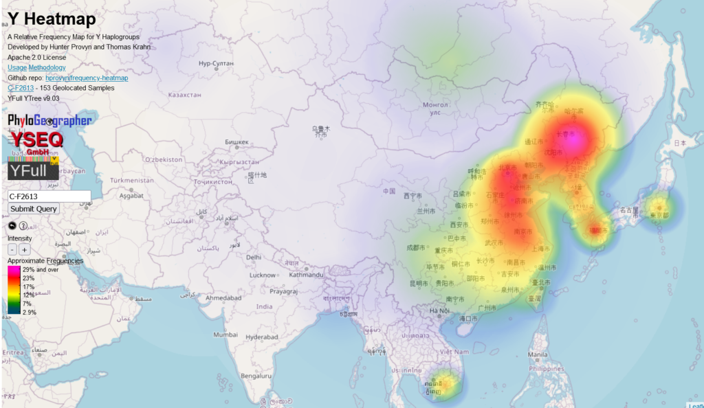
| East Asia | C-F2613 | Formed 33900 ybp, TMRCA 10900 ybp | none |
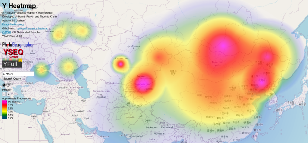
| Northeast Asia | C-M504 | Formed 14300 ybp, TMRCA 4000 ybp | 700ybp, Karaganda, Kazakhstan |
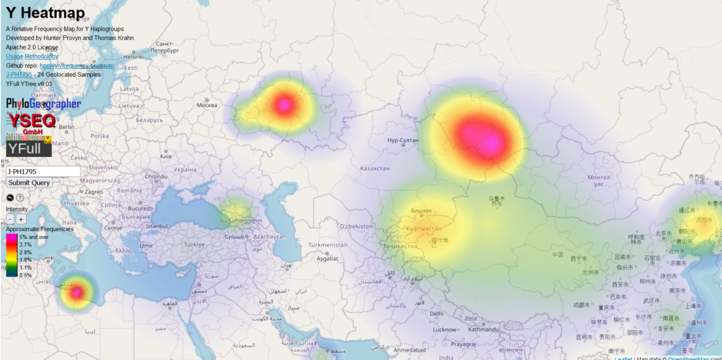
| Central Asia (Turkic) | J2a-PH1795 | Formed 6700 ybp, TMRCA 2000 ybp |
1100ybp, Altai Krai
|
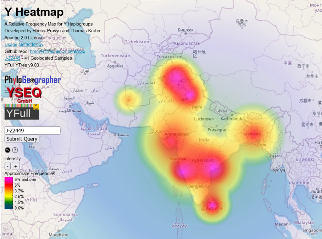
| South Asia | J2b-Z2449 | Formed 7400 ybp, TMRCA 7400 ybp |
2800ybp, Northwest Frontier, Pakistan
|
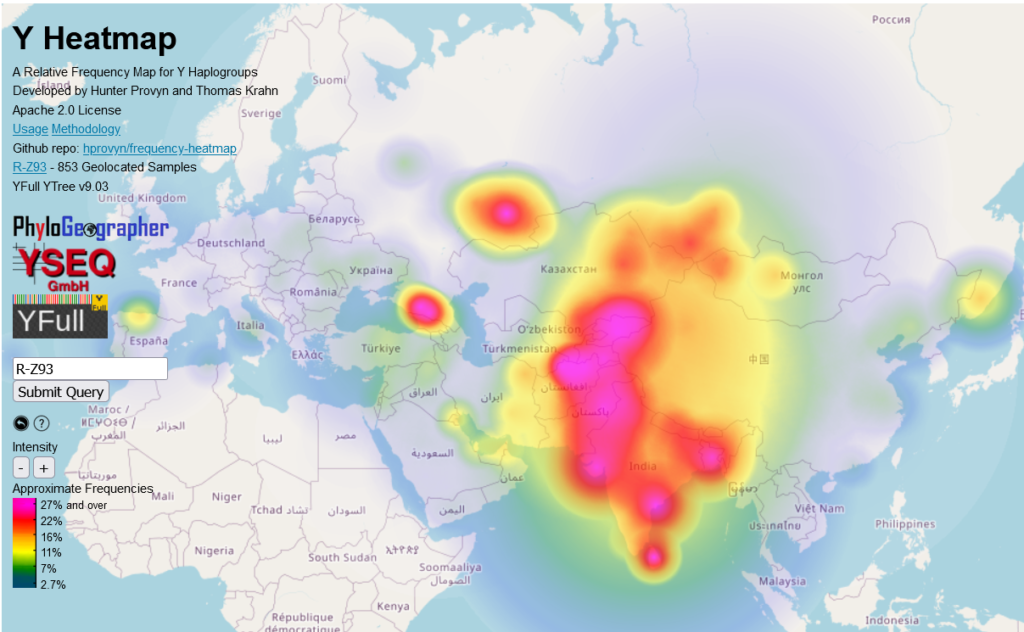
| South and Central Asia | R1a-Z93 | Formed 5000 ybp, TMRCA 4600 ybp |
3700ybp, Bashkortostan
|
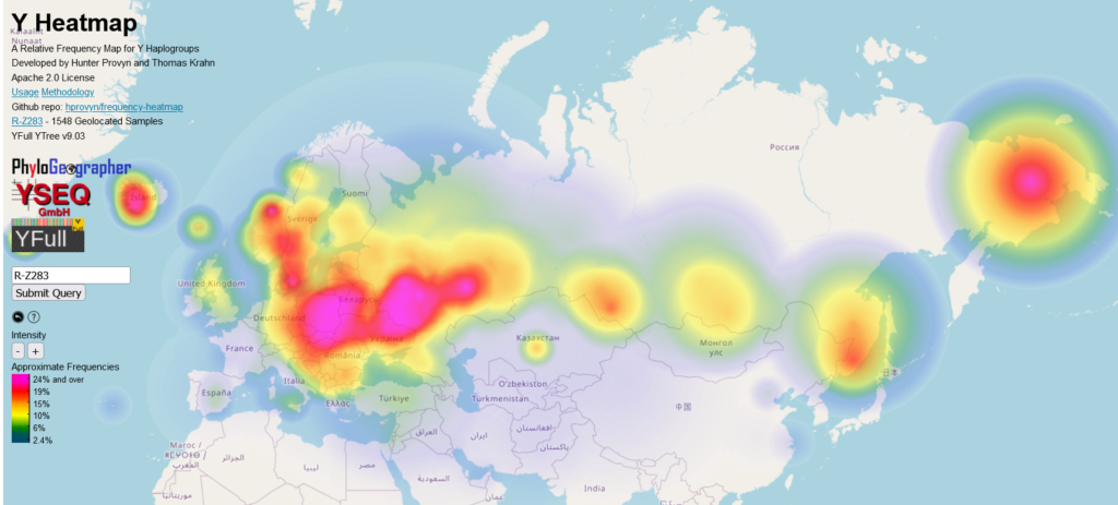
| Eurasia (Corded Ware) | R1a-Z283 | Formed 5000 ybp, TMRCA 4800 ybp | 4500 ybp, Ostergotlands Ian, Sweden, 3700 ybp Bashkortostan |
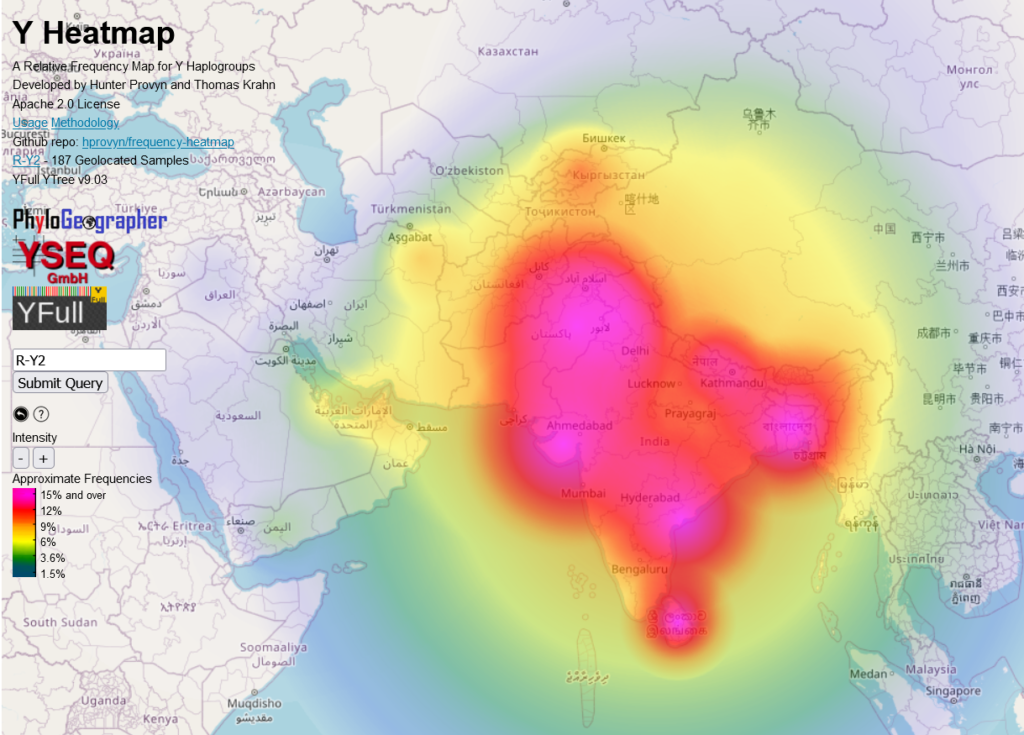
| South Asia | R1a-Y2 | Formed 4600 ybp, TMRCA 4300 ybp |
1600 ybp, Jalal Abad, Kyrgyzstan
|
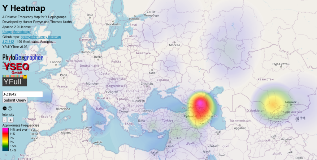
| Caucasus | J1-Z1842 | Formed 8100 ybp, TMRCA 6300 ybp | none with date |
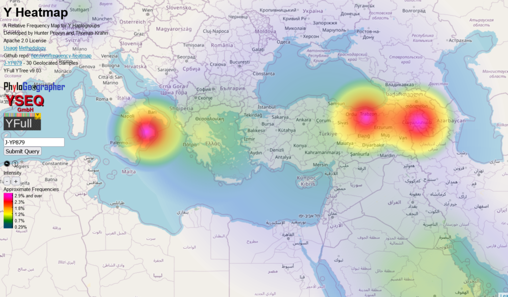
| Anatolia/Armenia | J2a-YP879 | Formed 9200 ybp, TMRCA 4200 ybp | none |

| Levant | J2b-M205 | Formed 15800 ybp, TMRCA 7200 ybp | 4400 ybp, Amman Jordan |
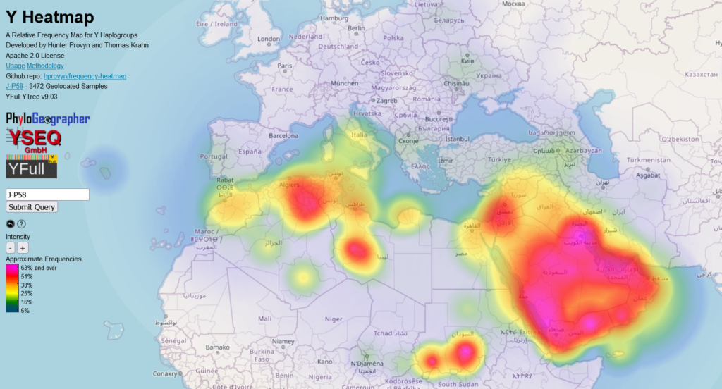
| Arabia | J1-P58 | Formed 11400 ybp, TMRCA 9100 ybp |
4400 ybp, Idlib, Syria
|
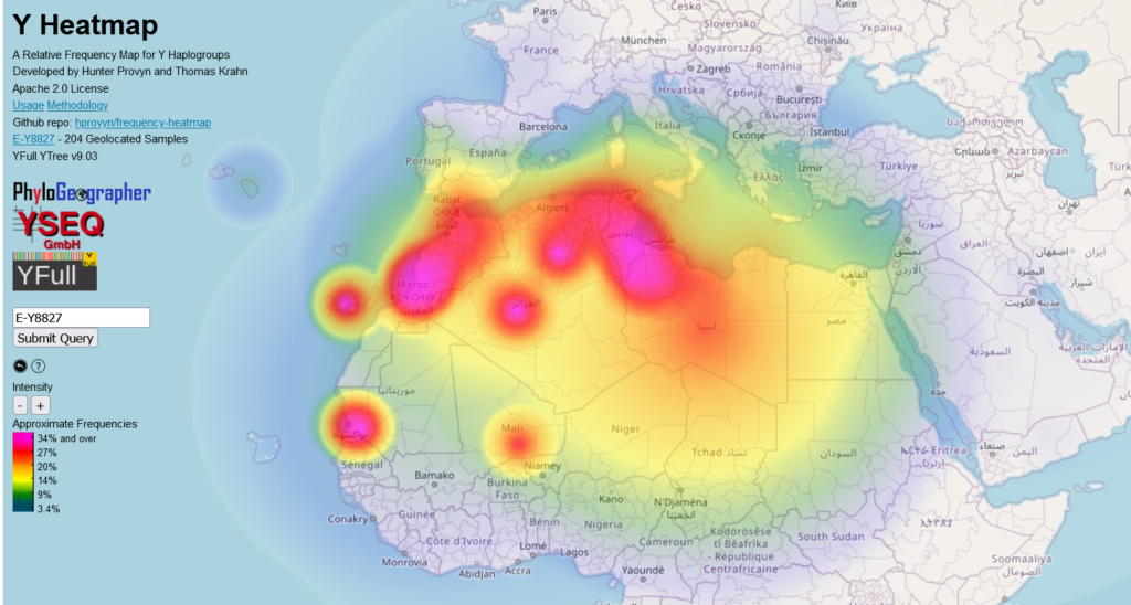
| North Africa (Berber) | E-Y8827 | Formed 2500 ybp, TMRCA 2200 ybp |
1400 ybp, Guanche from Tenerife
|
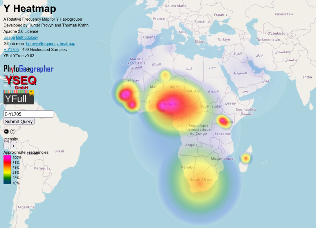
| Sub Saharan | E-M2>Y1705 | Formed 16200 ybp, TMRCA 14100 ybp | none |
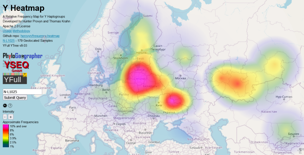
| East Baltic | N-L1025 | Formed 2800 ybp, TMRCA 2500 ybp |
1200 ybp, Saaremaa, Estonia
|
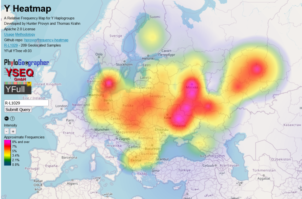
| Eastern Europe (Slavs) | R1a-L1029 | Formed 3100 ybp, TMRCA 2100 ybp | Volynsk, Sachsen-Anhalt, Volgograd, |
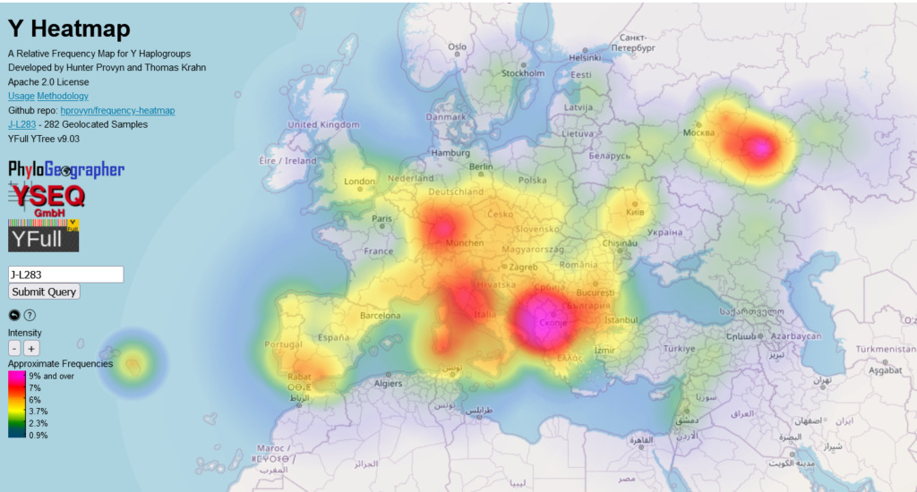
| Adriatic | J2b-L283 | Formed 9700 ybp, TMRCA 5200 ybp |
3900 ybp, Mokrin, Serbia
|
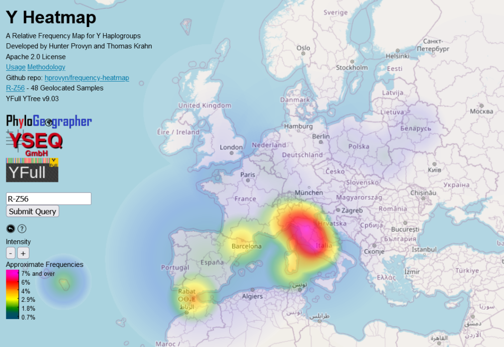
| Italy | R1b-Z56 | Formed 4400 ybp, TMRCA 4300 ybp | 2300ybp, Rome |
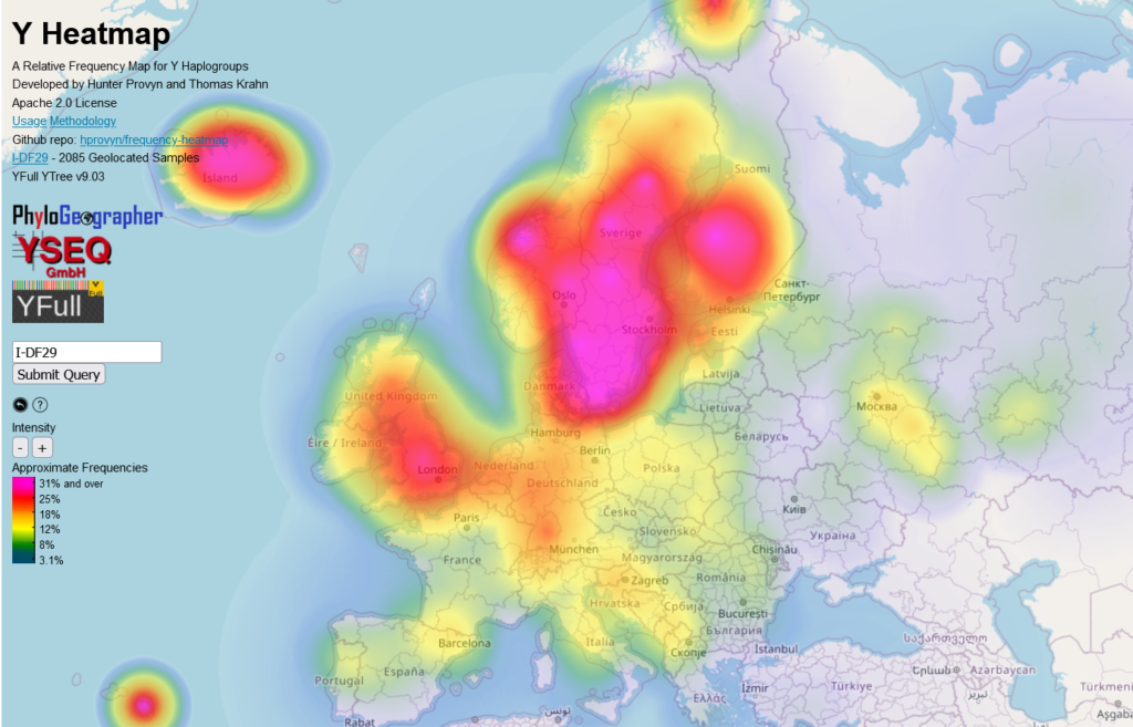
| Scandinavia | I1-DF29 | Formed 4600 ybp, TMRCA 4500 ybp |
3800 ybp, Skåne län, Sweden
|
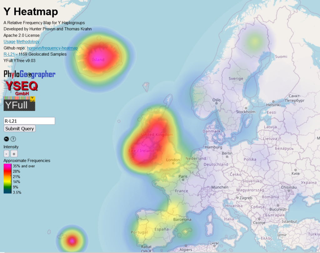
| British Isles | R1b-L21 | Formed 4500 ybp, TMRCA 4500 ybp |
I2445 4000 ybp, England
|
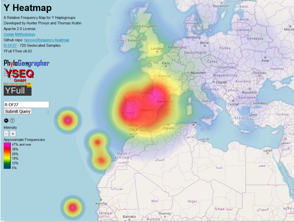
| Iberia | R1b-DF27 | Formed 4500 ybp, TMRCA 4500 ybp |
4100 ybp, Palermo, Sicily
|
Due to sample filtering rules I have added for PhyloGeographer the heatmap frequencies displayed for a haplogroup indigenous to Australia or the Americas is inconsistent as compared against frequencies elsewhere. So I have omitted these regions from this list.
This is an excellent analytic tool. Great statistical info.