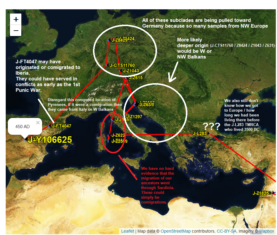
I find it useful to take PhyloGeographer migration maps (lookup your migration by SNP) of my haplogroup and to overlay the maps with additional information and/or corrections.
The current version of the PhyloGeographer algorithm has a hard time determining the true origin of a subclade when most of the descendants have undertaken a comigration to another area or if the homeland has not been extensively sampled yet.
In this case you can highlight portions of the theoretical computed migration that you think are suspect and label it with a very simple explanation. Like this:
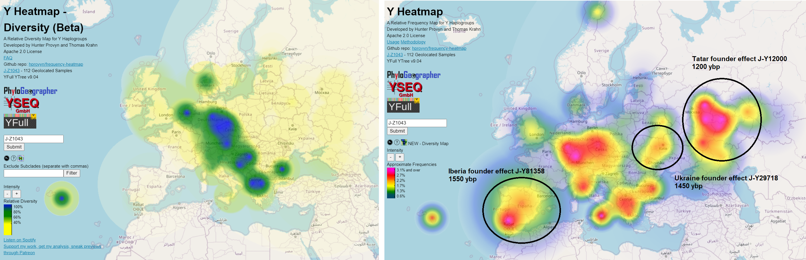
I also use the Frequency and Diversity Heatmaps in the same way.
I find that sharing information like this helps engage members of my haplogroup.
Interested haplogroup members are going to be more likely to be interested in contacting their matches to advance the research, breaking down their own brick walls in cases of unknown deeper paternal ancestry, and donating to your project's research fund.
Show the people in your haplogroup that the result of their expensive test(s) is more than just a 5 letter alphanumeric code.
The Diversity Heatmap will have a new animation feature, to be released publicly with YFull v9.05. As a thank you, my supporters on Patreon have exclusive early access to try it out.